

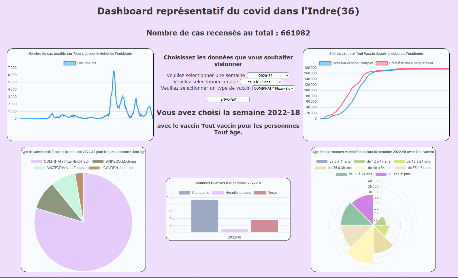
This end of semester project asked us to represent the state of COVID-19 in a department of France that was assigned to us. We thus obtained the public data on this subject, proposed by the government in xls format, using it as a database. We had to select the data we wanted to visualize as well as the way to visualize them.
I have therefore chosen to represent all types of data, in order to represent the global state of the pandemic in my department as requested, all with a minimum of graphics so that it fits on one page, and that it is not saturated with information.
This site allows a selection according to the week you wish to view but also the age group of patients or the type of vaccine used.
The appearance of the site did not matter in this project, so I spent little time on the layout and colors.
Tools and programming languages used:
- xls files
- PHP/MySQL
- HTML/CSS
- JavaScript
- Library chart.js